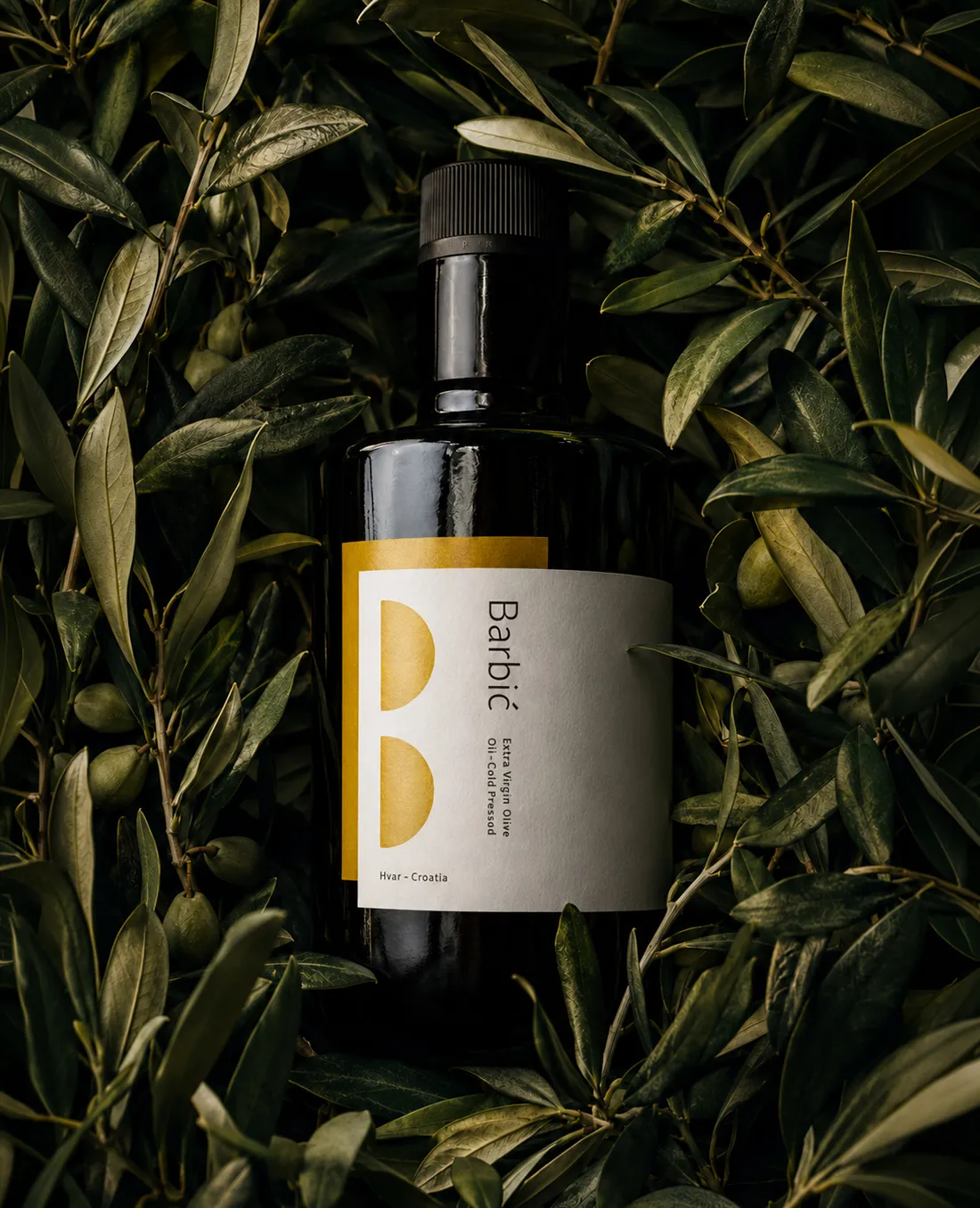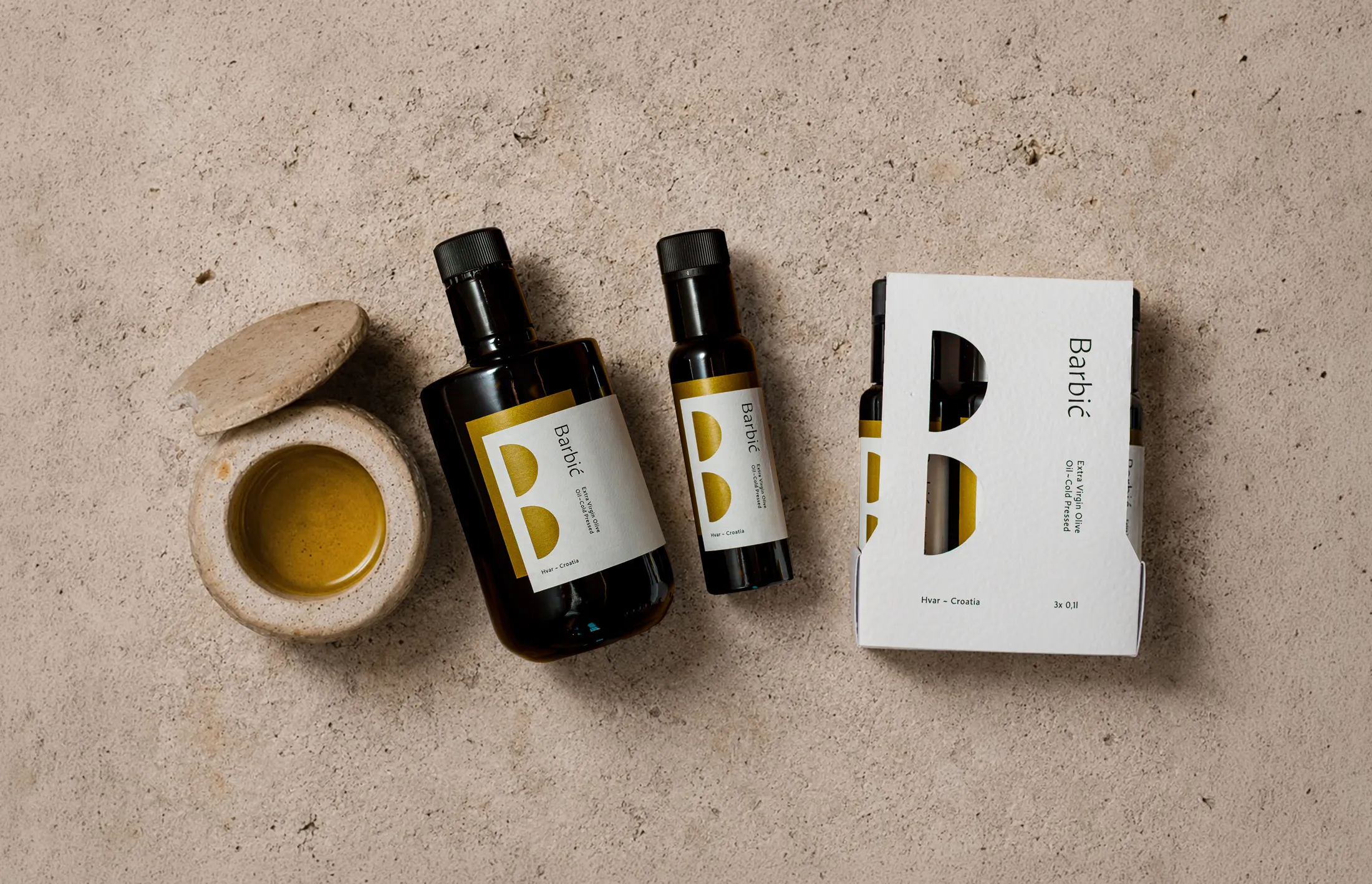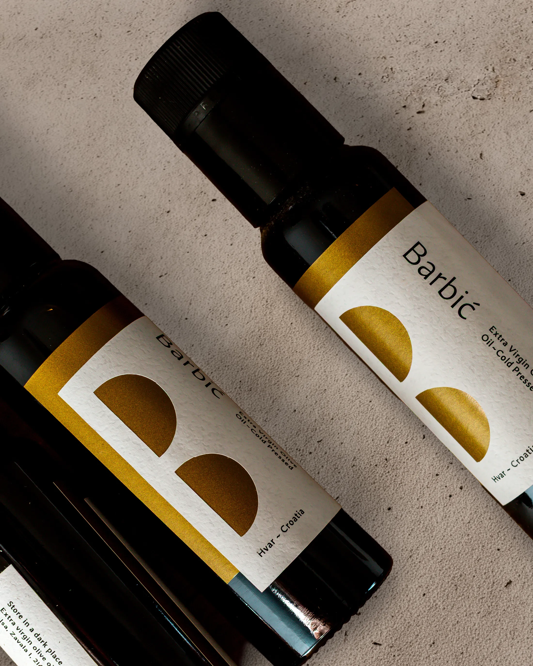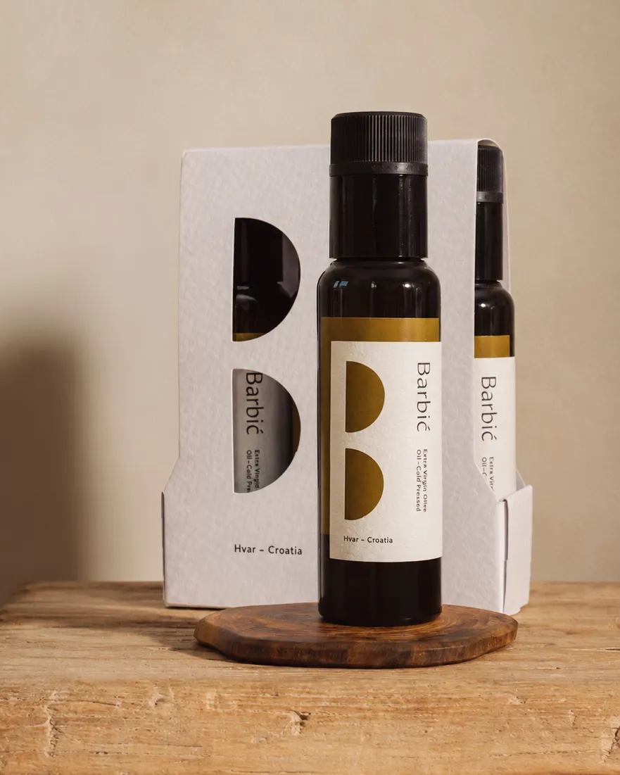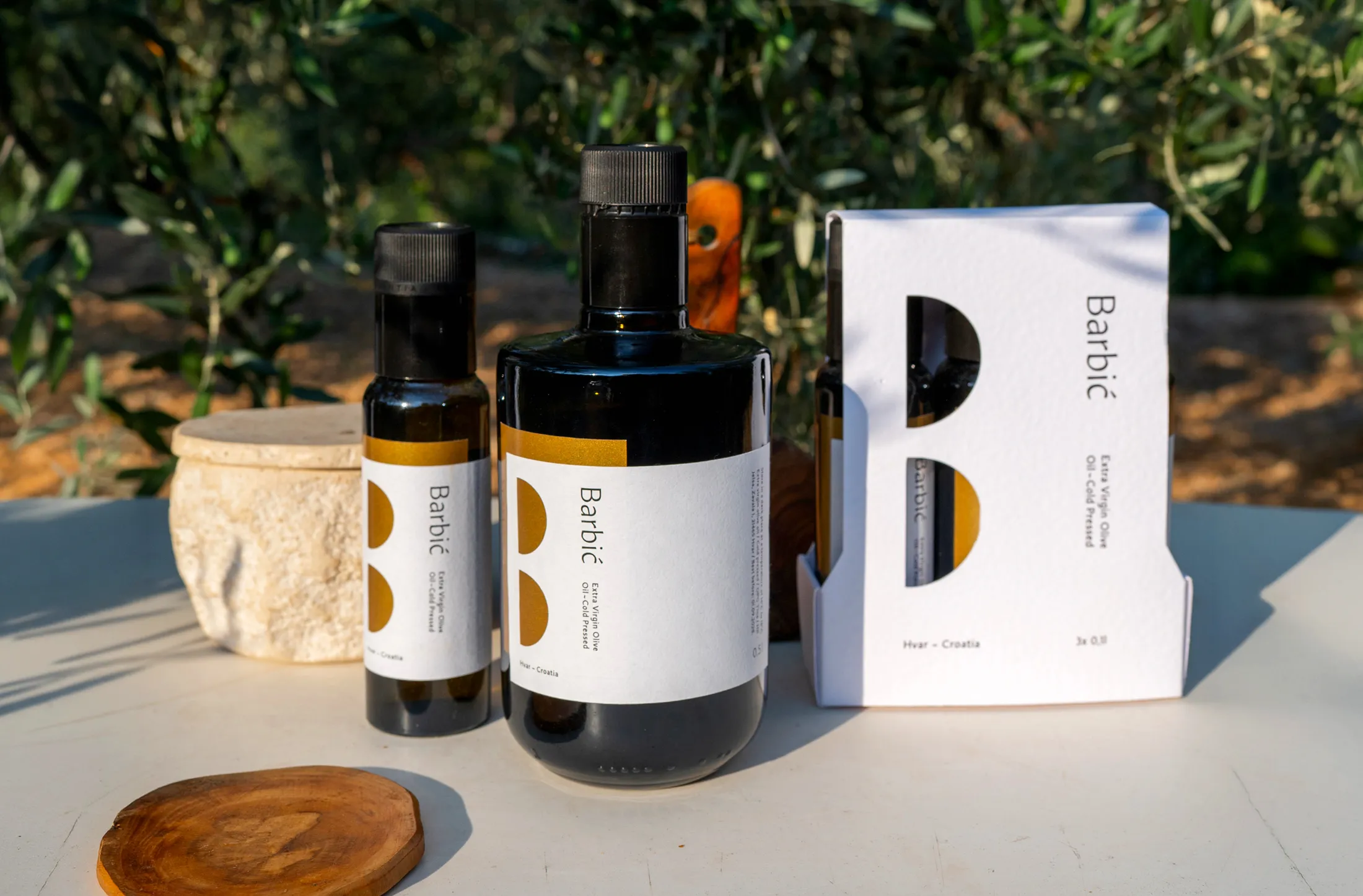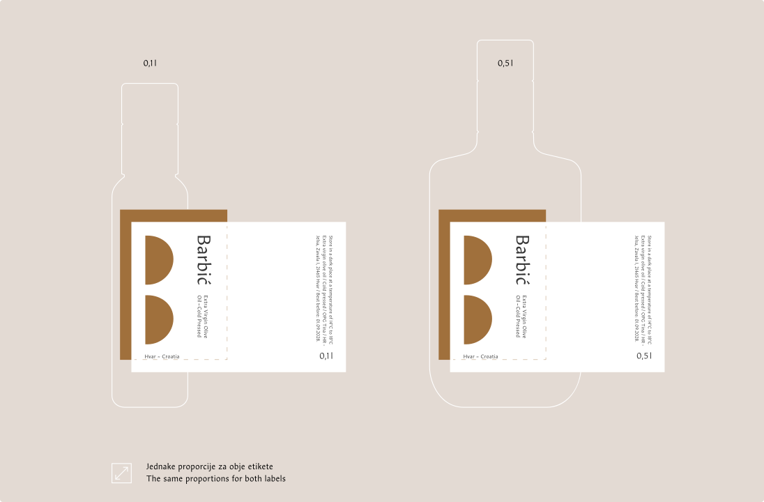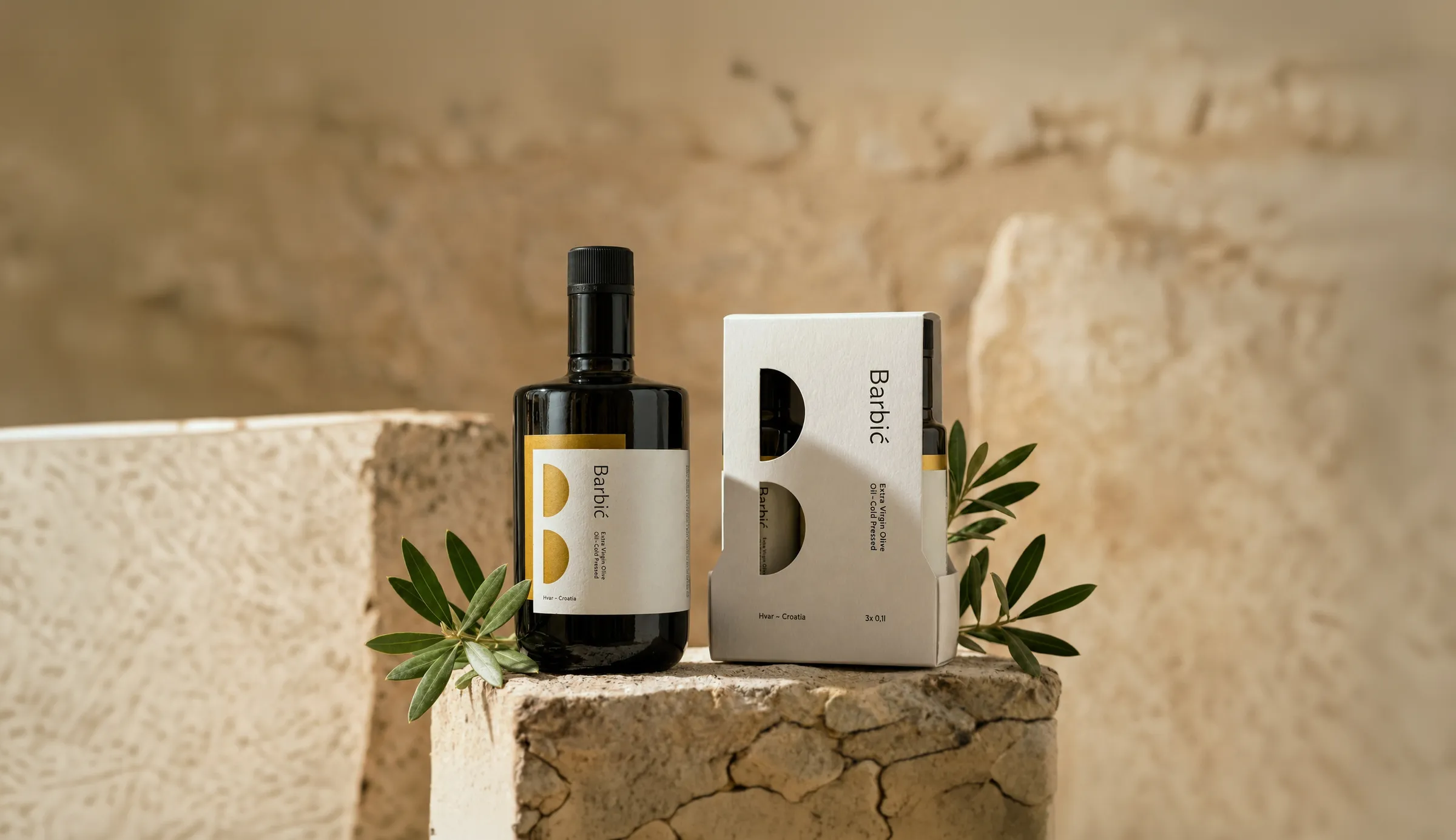
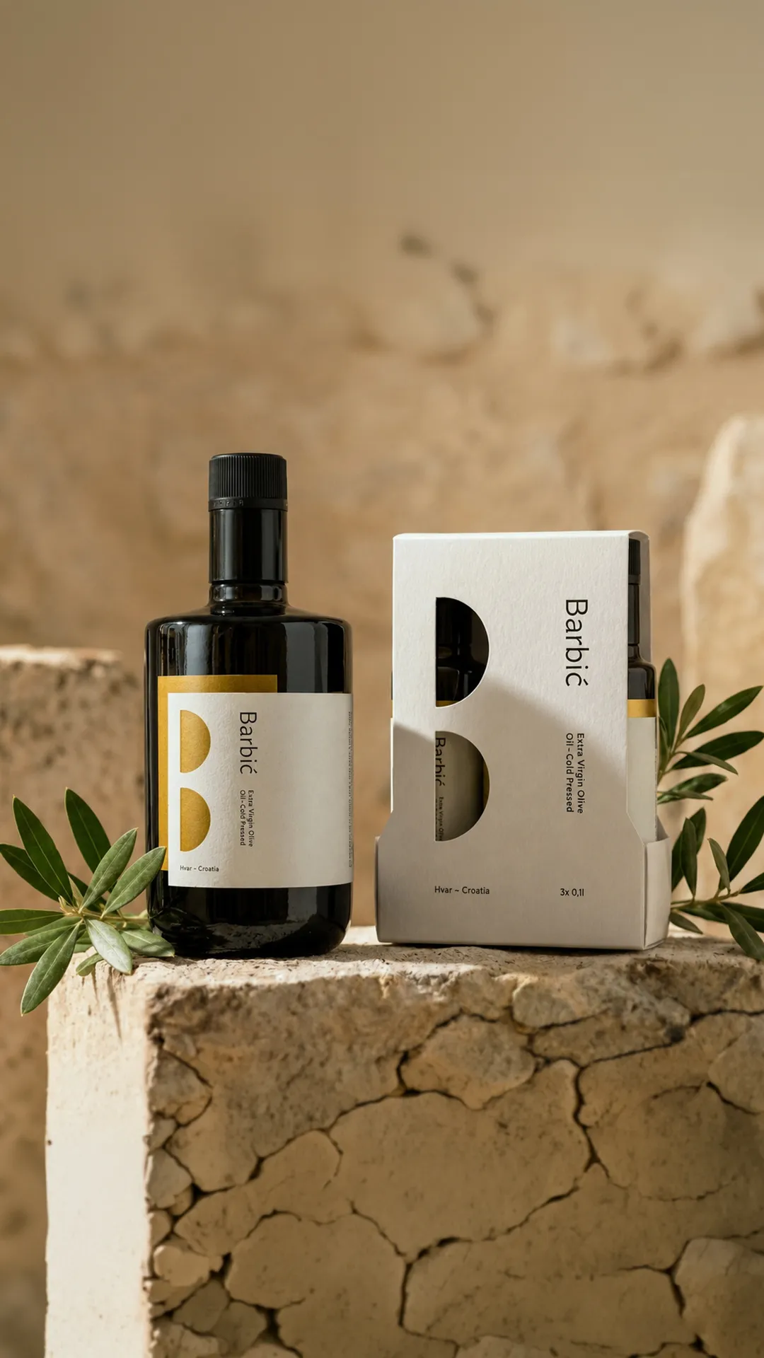
The development of the visual identity for Barbić olive oil emerged from the challenges of small-scale production. Due to the limited print run of labels, it was necessary to create a single solution that would work equally well on both 0.1L and 0.5L bottles.
The goal was to achieve balanced proportions and maintain recognizability across both packages. The central element of the label is a cut-out shape inspired by two halves of an olive fruit, which also forms the initial letter B, referencing the Barbić family name. For tourists traveling by air, a special package was developed featuring three 0.1L bottles, adapted to carry-on liquid restrictions.