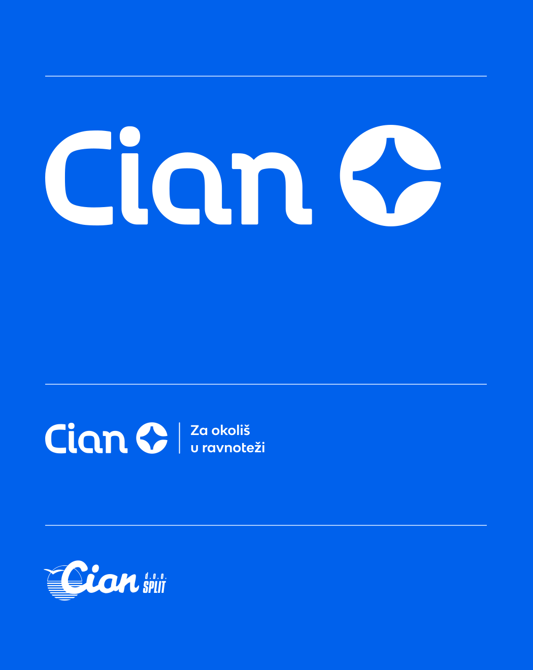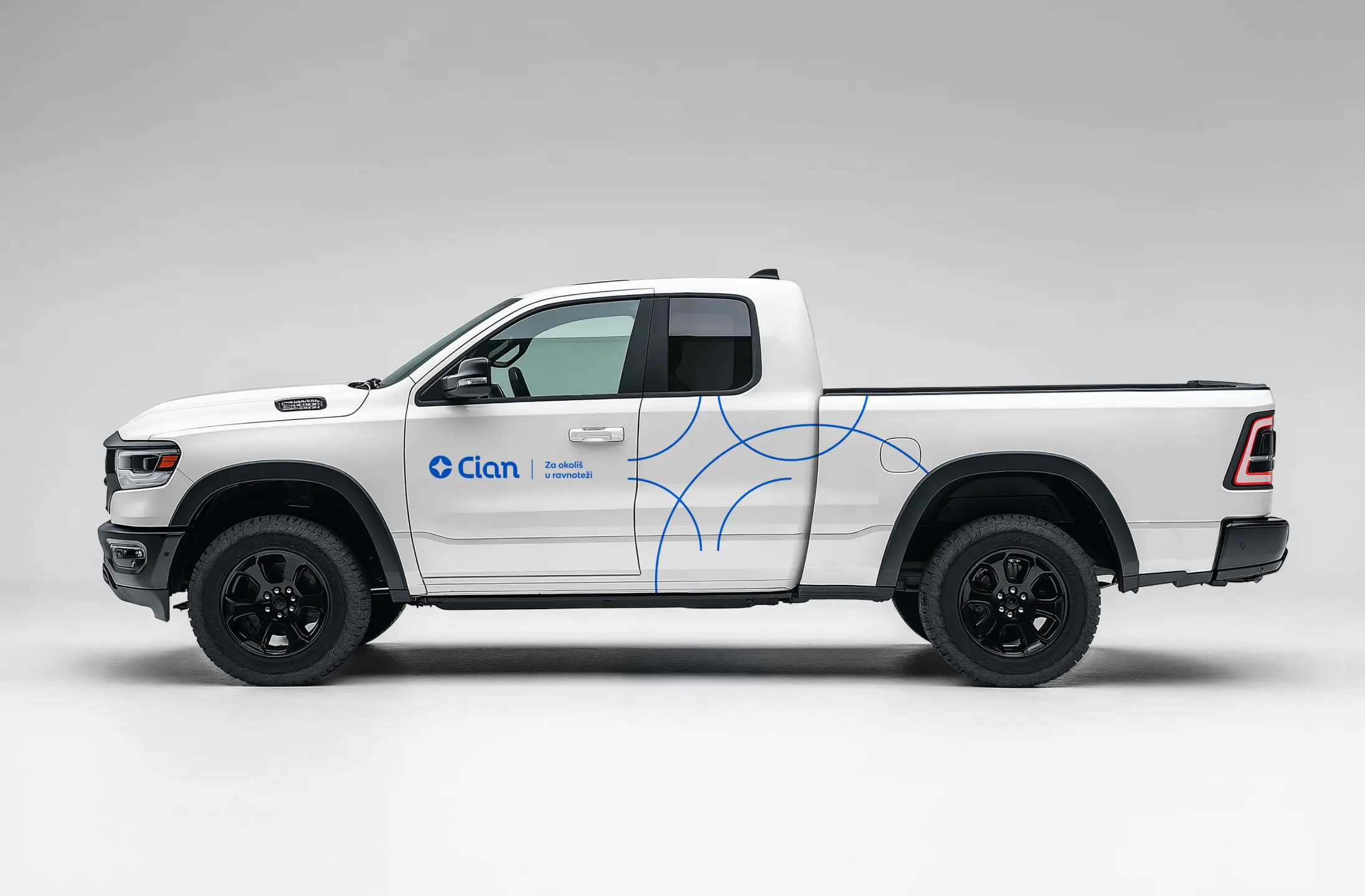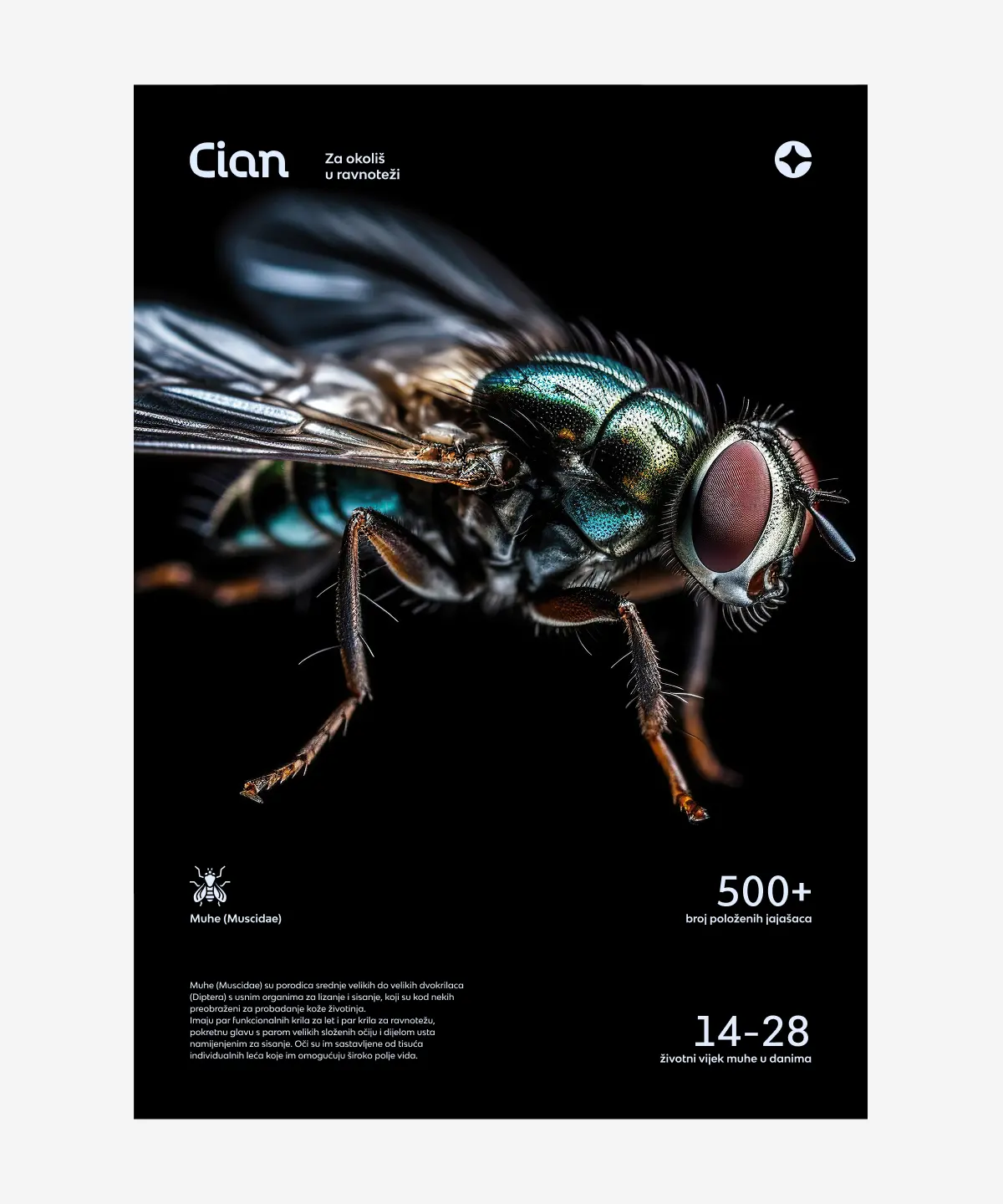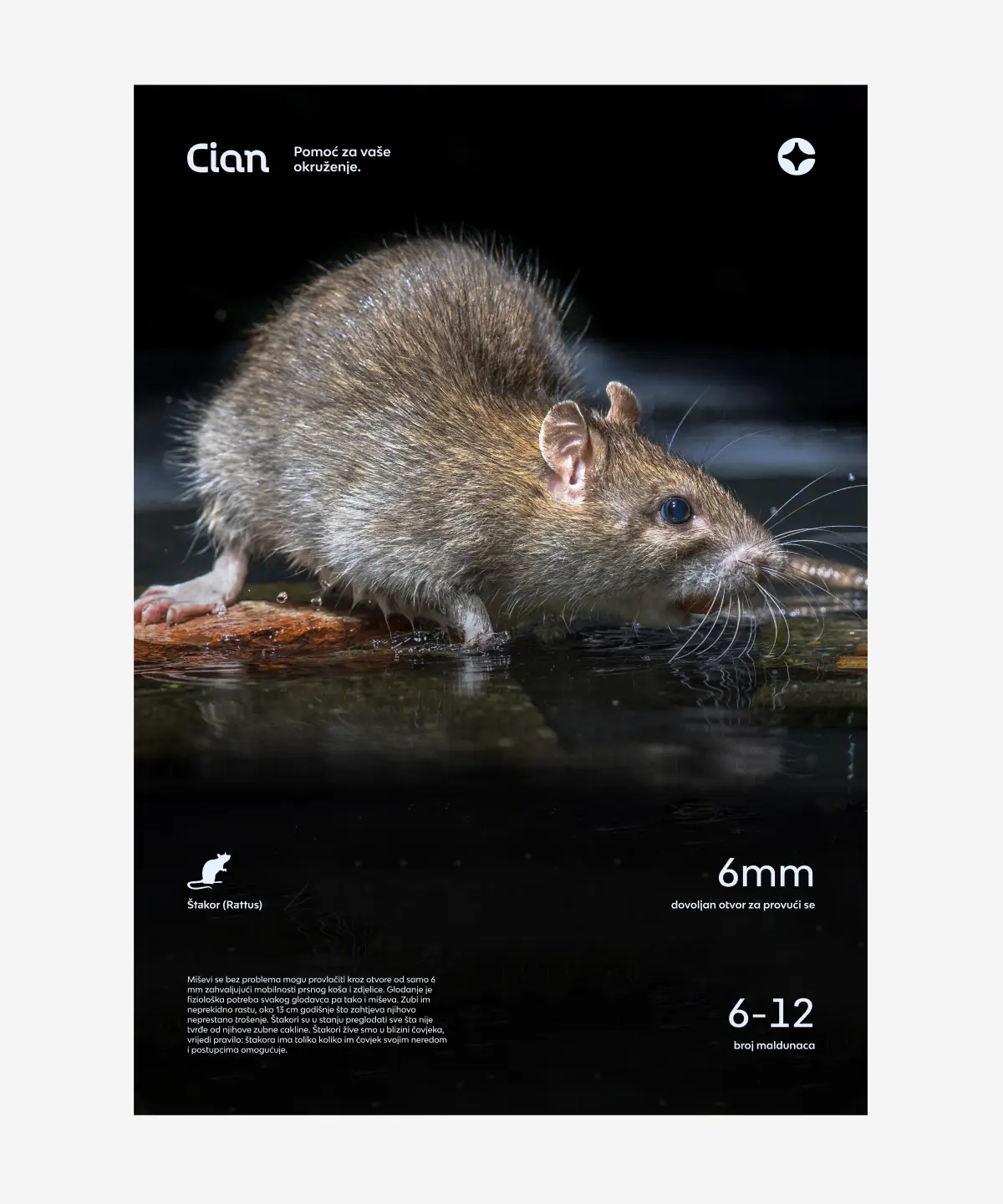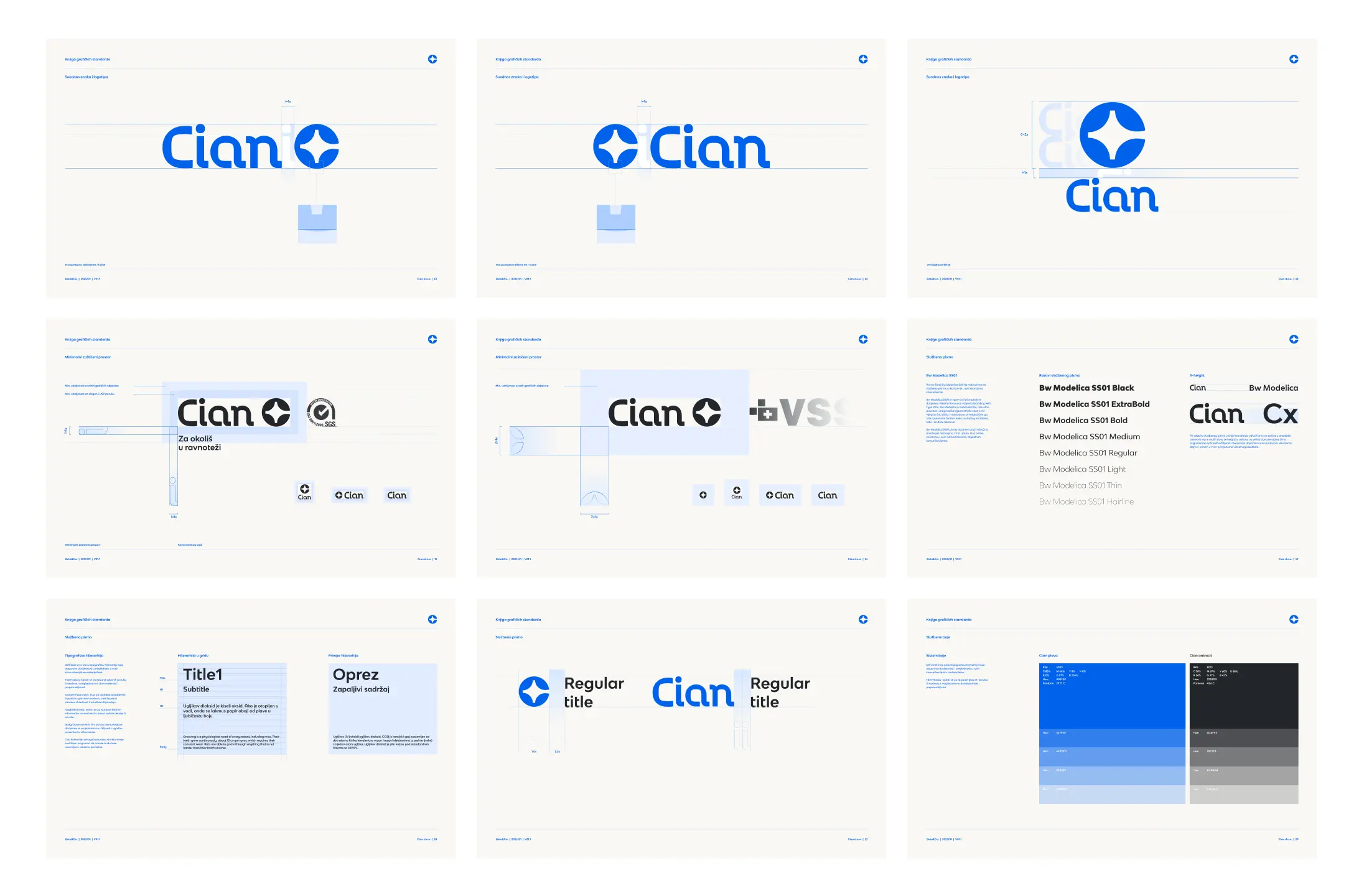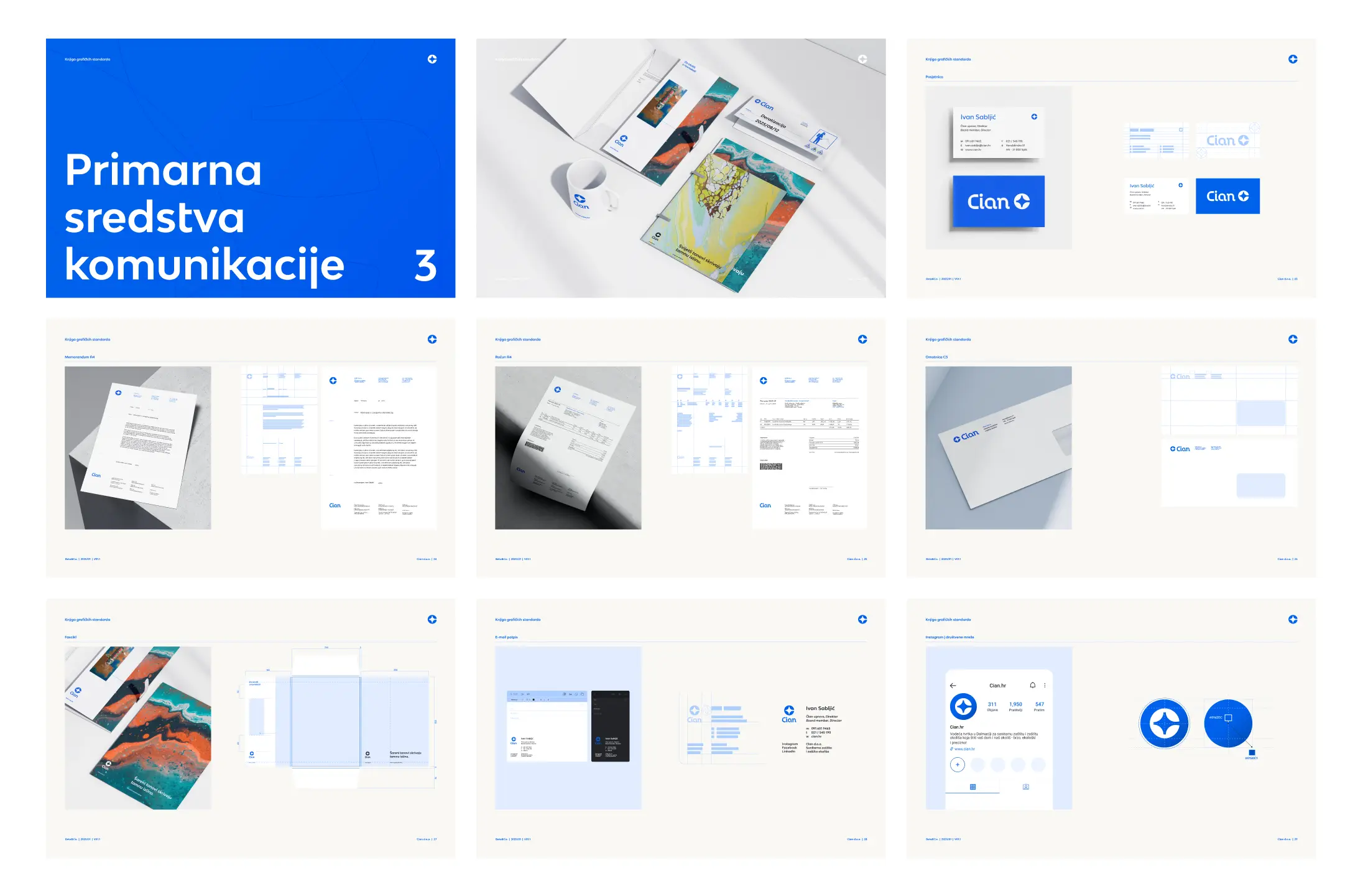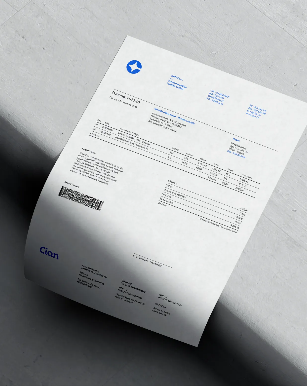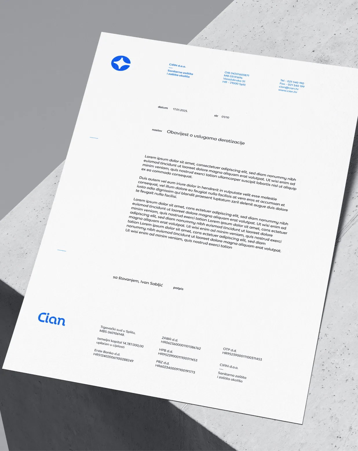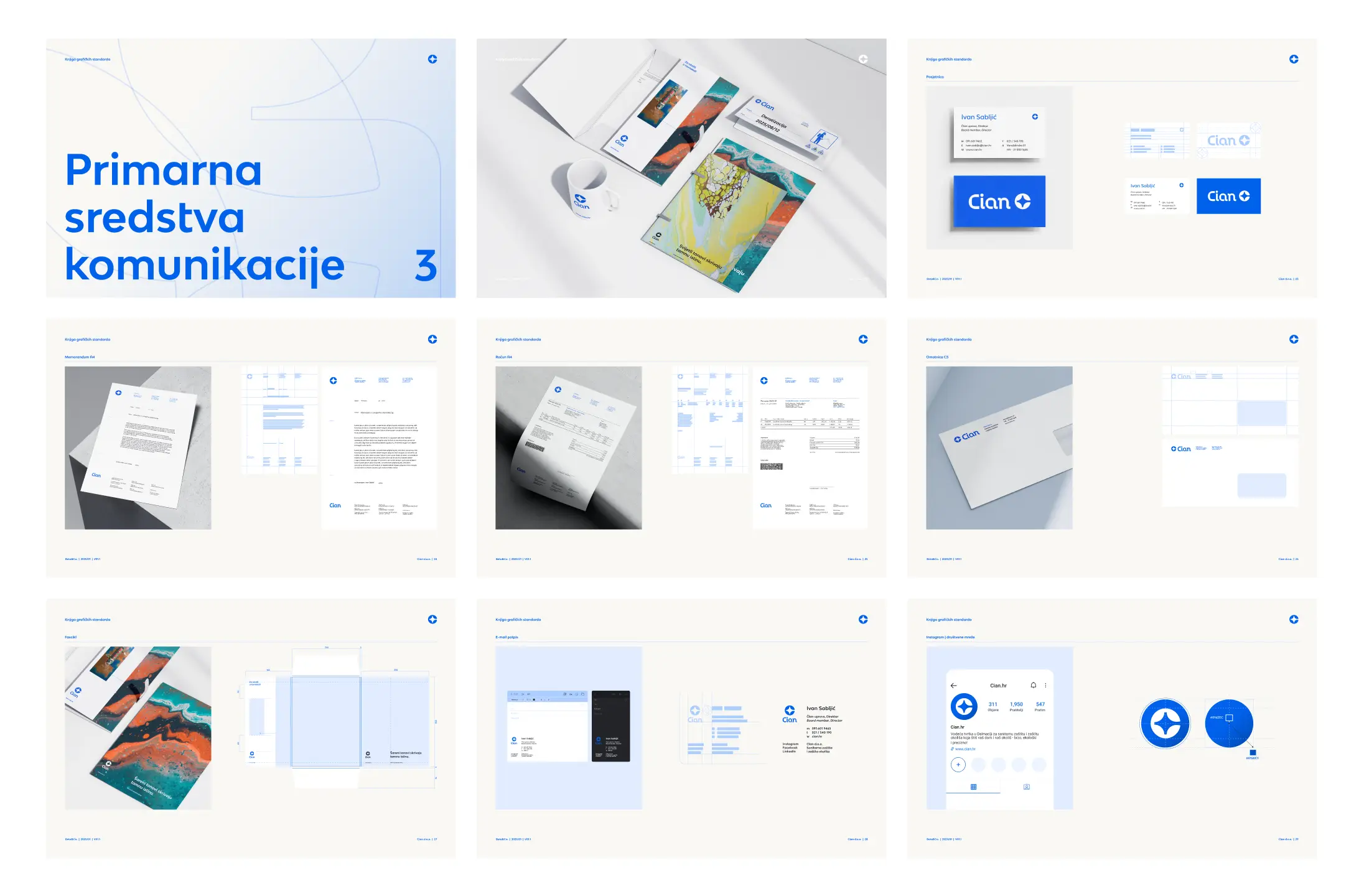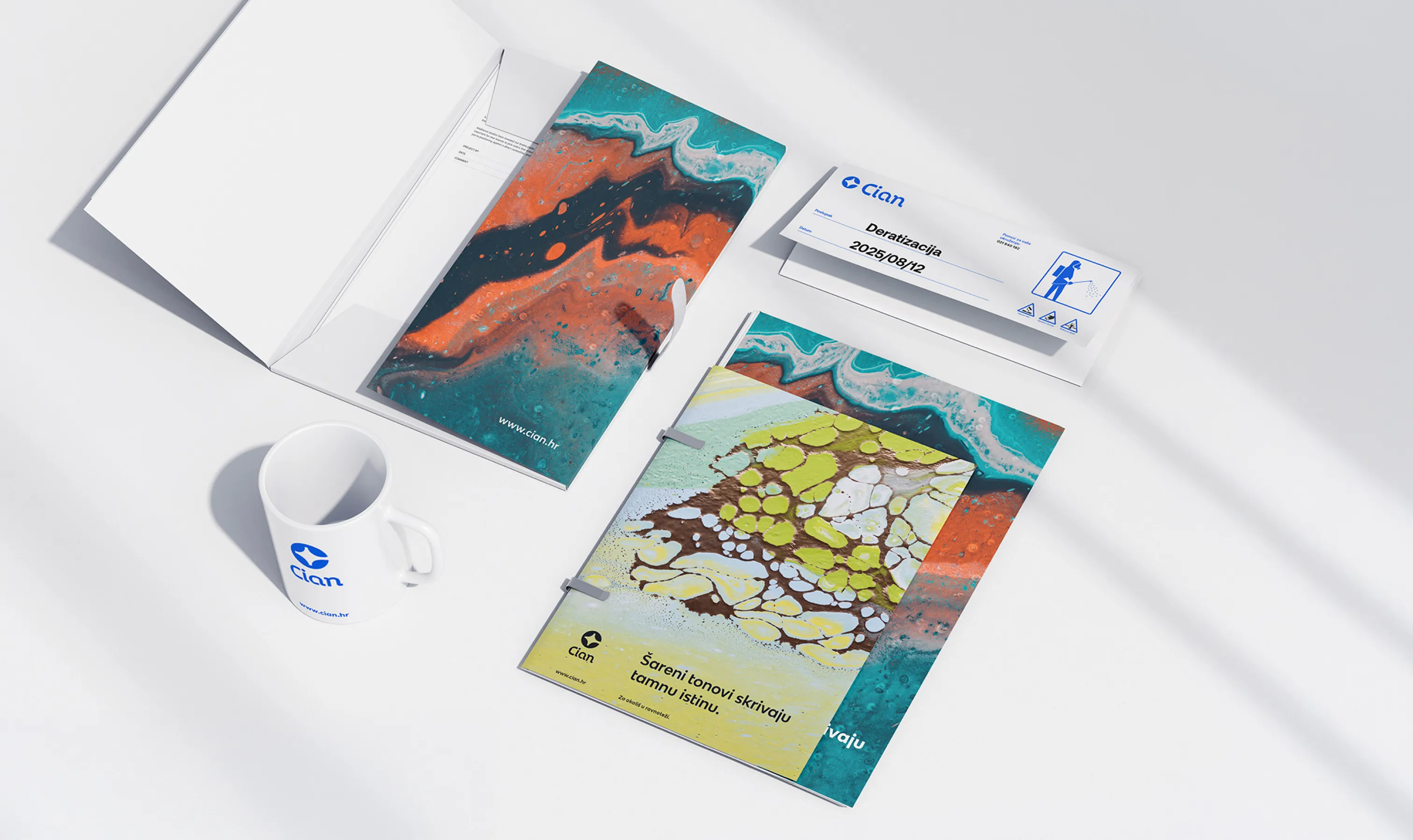
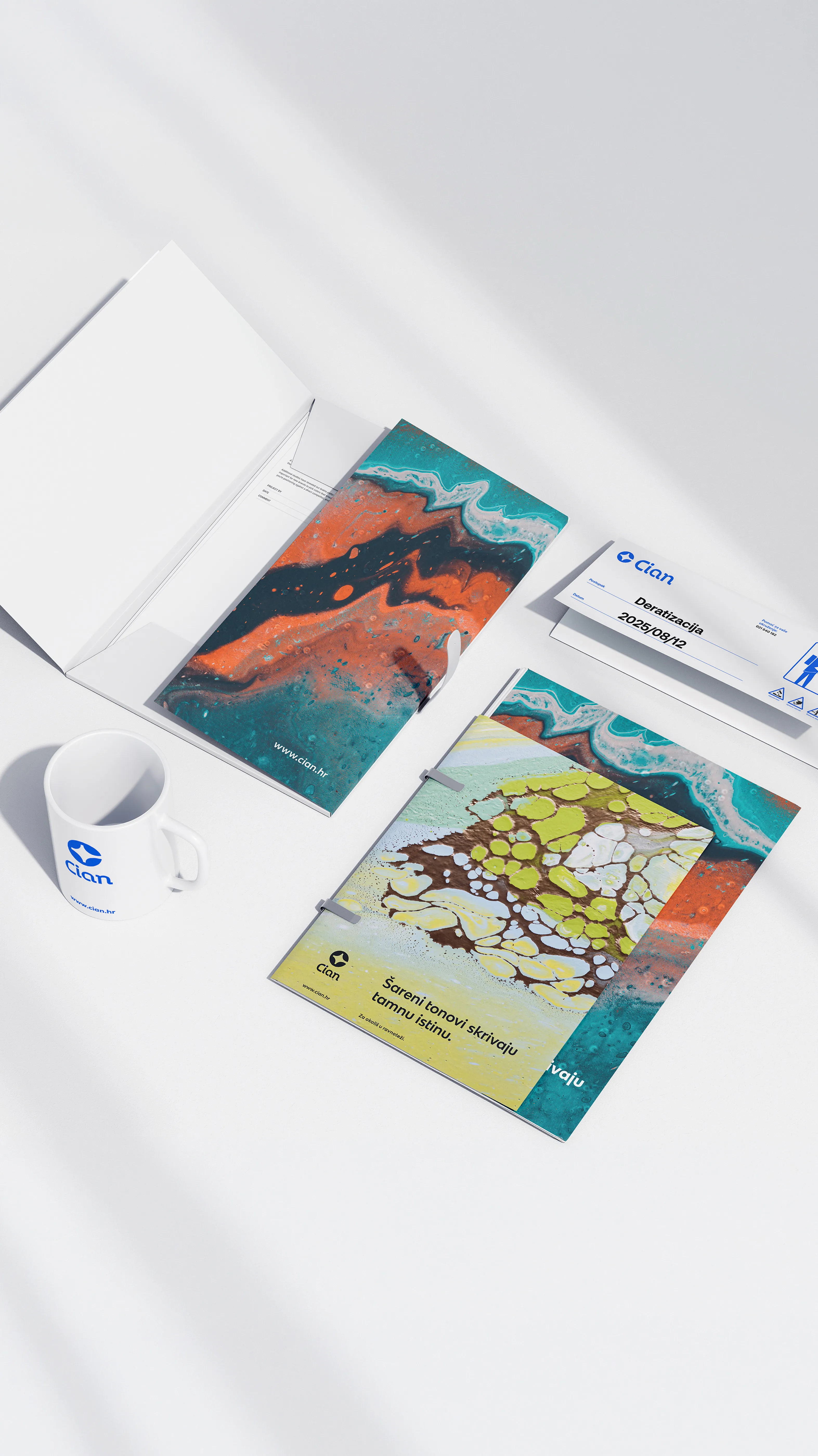
We executed a complete rebranding for the company Cian – covering everything from the new visual identity and logo, typography, and communication materials down to the finest details.
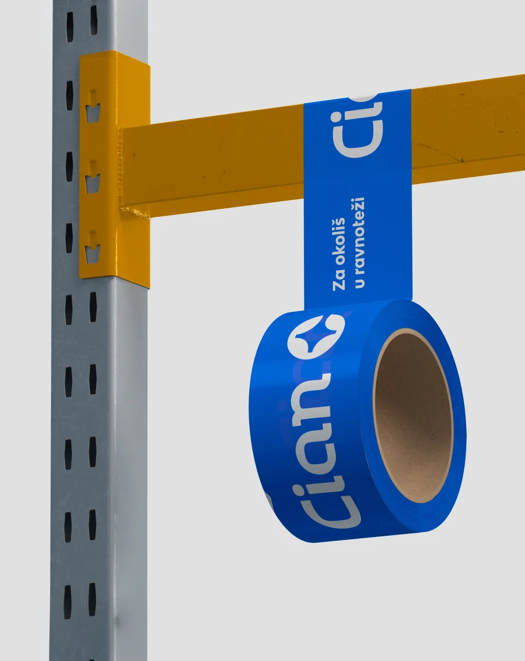
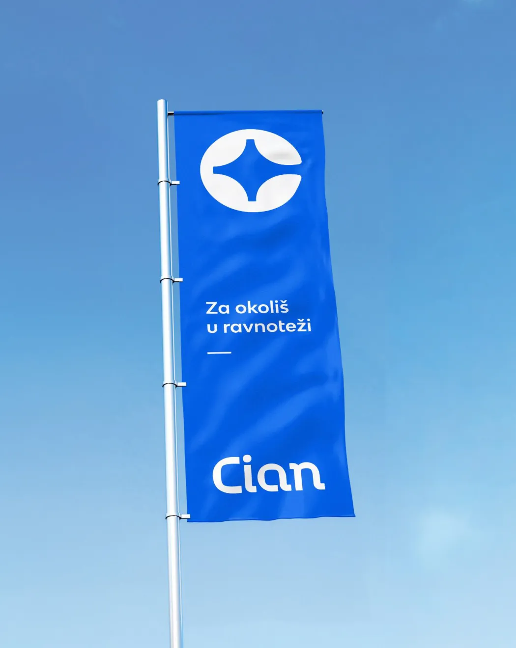
We then brought it all to life in the real world – applying the design to vehicles, workwear, packaging, and signage... In short, from the logo to the mouse bait.
The symbol itself blends geometric precision with organic forms. It is based on the letter "C," shaped by four stylized leaves, while the negative space creates a shooting star – a symbol of purity and transformation. The circular shape evokes Planet Earth and sustainability, while the blue color further emphasizes the connection to the sea and the environment.